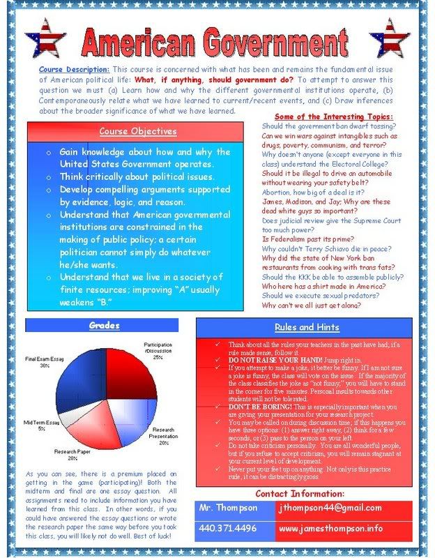
I typed up all my thoughts and was left with a giant mess. To organize the clutter, I used a pen and paper to draw how my ideal newsletter would look. I put the title on top, contact information on the bottom and sectioned off the paper into five other subdivisions. I was now ready to turn my information into an attractive newsletter.
Since the course was American Government, I thought it would be appropriate to use a red, white, and blue theme. Of course I didn’t want to stick to just three basic colors so I used shading all over the entire document. I’m colorblind so I periodically had my roommates make sure everything was staying red, white, and blue. I could have very easily made a red, white, and green document which may have lead the viewer to think the government syllabus was referring to Belarus, not America.
I already had a thin blue line with stars in it on my computer and wanted to use that as the border for my document. Wow, this was a task! I did not know it was so difficult to use a custom image to create a border. Of course it was only difficult to me because I had to figure out how to do it; everything is easier the second time around.
I then filled in the blank spaces with my content. I used WordArt to put an attractive “American Government” title on the page. I put a star that had a flag design on both sides of the title. To acquire this image I used Google’s image search (images.google.com). Below that I typed the course description in blue but highlighting the fundamental issue (What, if anything, should government do) in red. I inserted four text boxes for the remaining content areas. Two of these text boxes had shaded colored backgrounds, one blue and one red.
Since I already had my breakdown of grades in percentage form, I thought it would be nice to insert a pie chart for the grades section. I made a simple spreadsheet on Excel and figured out how to make a pie chart. It was amazing simple. I used five shades of red, white and blue to differentiate the five pieces of the pie. I simply copied the graph and pasted it into Word.
Finally I inserted a table into the document to house my contact information. I’ve always been nervous of using tables, but it was surprisingly simple. I straightforwardly grabbed the table pen and drew a table. I shaded the different cells and inserted my text; simple enough! I was nervous to try to do something like this on Word but it turned out to be a great learning experience.
Specific things I learned from this assignment:
o It is much easier to draw an outline on paper then trying to imagine the entire document in my head.
o How to use an image from a file for the boarder of a document.
o How to make WordArt.
o How wrapping style works for pictures.
o How to insert and use text boxes in Word.
o How to make a graph in Excel and place it into Word.
o How to use color shading.
o How to make a table.
o Concepts of visual literacy.
o How to make an attractive newsletter using Word.
Here’s what my document looks like:
(It's a little grainy because it was shrunk a little bit)


No comments:
Post a Comment